Python Program to Plot Sine Function Using Numpy & Matplotlib
To plot sine wave in python, we use NumPy library and Matplotlib library.
NumPy is the fundamental package for scientific computing with Python. Matplotlib is a Python 2D plotting library which produces publication quality figures in a variety of hardcopy formats and interactive environments across platforms.
In this python program we use NumPy to generate time values and calculate sin(time) for sine data. And Matplotlib is used to handle plotting data and configuring plot attributes like label, grid etc.
Python Source Code: Sine Function
# Importing Required Libraries
import numpy as np
import matplotlib.pyplot as plt

# Generating time data using arange function from numpy
time = np.arange(-3*np.pi, 3*np.pi, 0.01)

# Finding amplitude at each time
amplitude = np.sin(time)

# Plotting time vs amplitude using plot function from pyplot
plt.plot(time, amplitude)

# Settng title for the plot in blue color
plt.title('Sine Wave', color='b')

# Setting x axis label for the plot
plt.xlabel('Time'+ r'$\rightarrow$')

# Setting y axis label for the plot
plt.ylabel('Sin(time) '+ r'$\rightarrow$')

# Showing grid
plt.grid()

# Highlighting axis at x=0 and y=0
plt.axhline(y=0, color='k')
plt.axvline(x=0, color='k')

# Finally displaying the plot
plt.show()
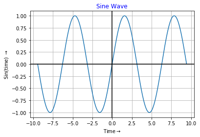
Sine Wave Output
Python Sine Wave: Exaplanation (Step Wise)
-
Step 1: Importing Libraries Code
import numpy as npandimport matplotlib.pyplot as pltare used to import numpy and matplotlib.pyplot Library. -
Step 2: Generating Time Data Code
time = np.arange(-3*np.pi, 3*np.pi, 0.01)is used to generate data form -3*π to 3*π in equal interval of 0.01. Functionarange()is defined in numpy. -
Step 3: Generating Amplitude Data Code
amplitude = np.sin(time)is used to calculate sine value at each generated time data. Functionsin()is also defined in numpy. -
Step 4: Plotting Code
plt.plot(time, amplitude)is used to plot generated data of time and amplitude. Here time is x-axis data and amplitude is y-axis data. - Step 5: Setting Title Code
plt.title('Sine Wave', color='b')is used to set title of the generated figure in blue color.color='b'indicates title is in Blue Color. -
Step 6: Setting Labels Code
plt.xlabel('Time'+ r'$\rightarrow$')andplt.ylabel('Sin(time) '+ r'$\rightarrow$')are used to set labels for x-axis and y-axis. Herer'$\rightarrow$is used to generate right arrow → which is concatenated with Time and Amplitude using + operator. - Step 7: Showing Grids in Figure Code
plt.grid()is used to display grid in generated plot. - Step 8: Highlighting Origin Line Code
plt.axhline(y=0, color='k')andplt.axvline(x=0, color='k')are used to high light x=0 line and y=0 line in generated plot. - Step 9: Finally Displaying Figure Code
plt.show()is used to display final plot in output.